Product / UXUI
Peer Comparison Dashboard
F5's Bot Defense platform helps security teams understand automated traffic across applications and environments. The Peer Comparison Dashboard enables users to compare their traffic against similar organizations, providing context beyond raw metrics. By visualizing bot activity, request types, and mitigation outcomes alongside peer averages, the experience supports faster pattern recognition, clearer comparisons, and more confident decision-making.
Client F5
Role UX Design / Product Design / Data Visualization
Publication 2025 Bot Defense / F5 Distributed Cloud Services
Challenge
Problem
Security teams lacked a clear way to understand how their bot traffic compared to similar organizations. Existing dashboards presented raw metrics but provided little context for determining whether activity was typical or an outlier.
Solution
Designed an interactive peer comparison dashboard that benchmarked customer traffic against relevant peer groups, enabling faster interpretation through comparative visualizations, flexible KPIs, and validated comparison patterns.

Dashboard
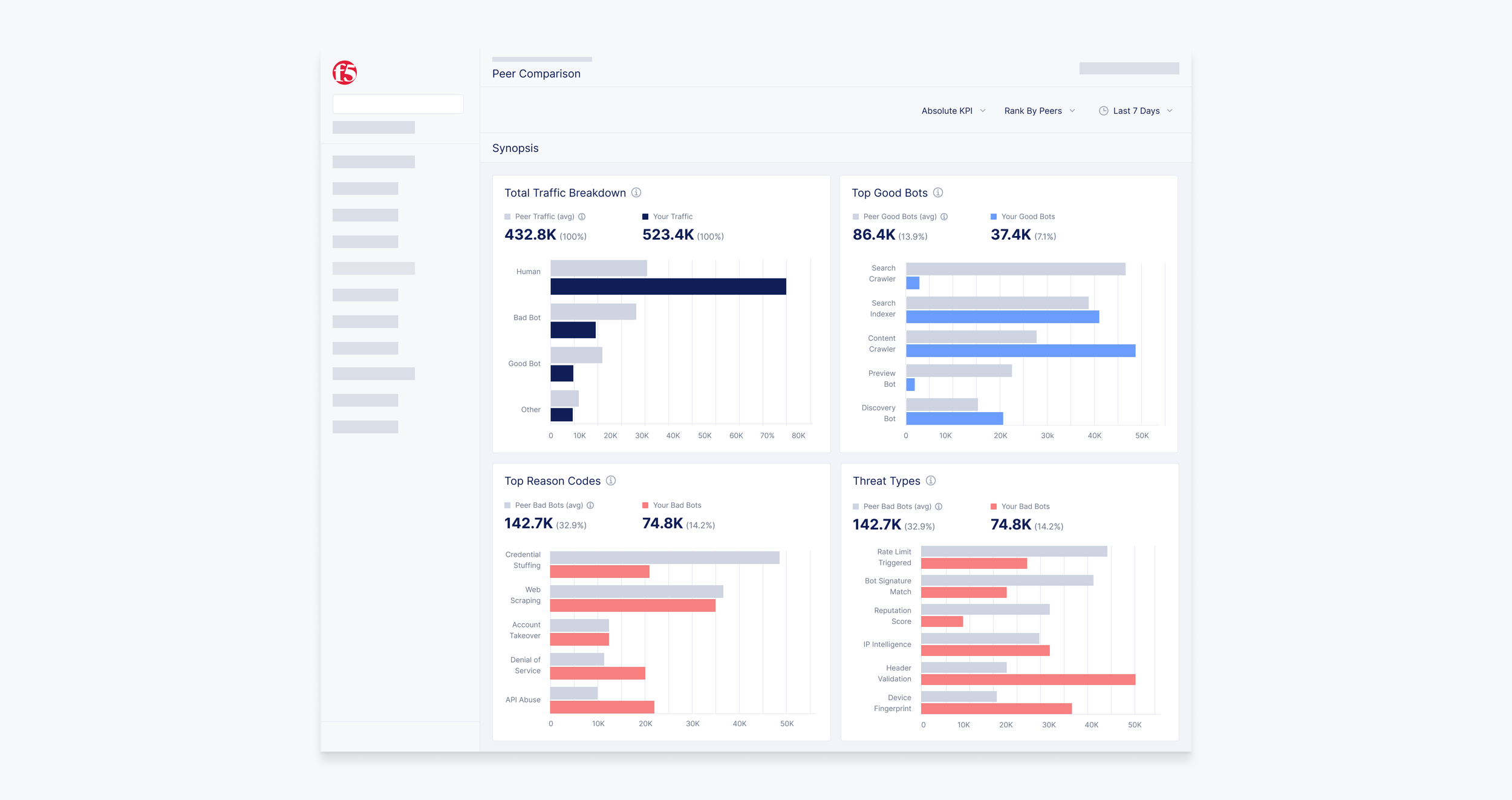
The dashboard provides a high-level comparison between customer and peer traffic, allowing users to benchmark key metrics across bot activity, request types, mitigation outcomes, and threat categories. Each visualization was designed to make differences immediately recognizable while supporting deeper exploration.
Data Visualization
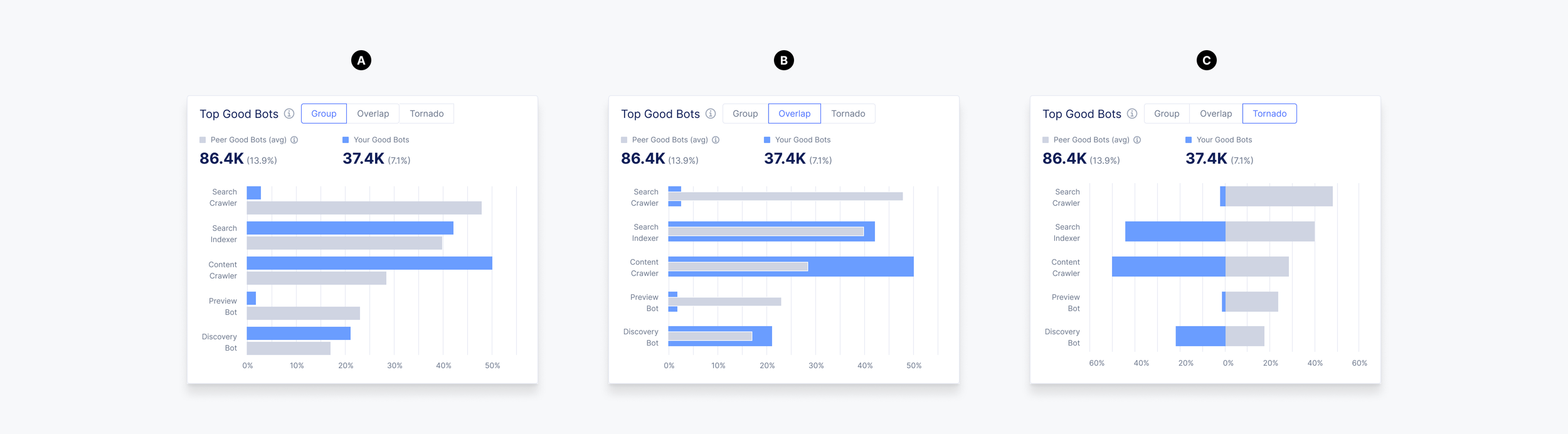
Multiple comparison visualizations were explored to identify the clearest way to communicate differences between customer and peer data. Concepts evaluated readability, comparison accuracy, and pattern recognition across several chart types. The selected visualization was standardized across the dashboard after validation.
A. Group
Side-by-side comparison
Quick pattern recognition
Final direction
B. Overlap
Layered comparison
Shared value emphasis
Harder to scan
C. Tornado
Directional comparison
Emphasizes variance
Best for variance analysis
KPI Exploration
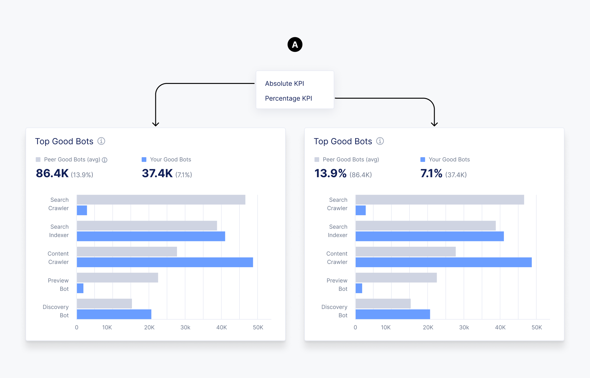
Explored how comparison metrics should be presented across the dashboard. Concepts focused on giving users flexibility between absolute values and percentages, while supporting different ranking perspectives for customer and peer data.
A. KPI Values
Absolute metrics
Percentage metrics
Default view
B. Ranking
Rank by customer
Rank by peers
Comparison context

User Research
Maze studies were conducted to validate comparison workflows, visualization preferences, and default behaviors before implementation. The findings below summarize the key insights that directly influenced the final UI.
Research Goal
Determine the preferred default comparison perspective for ranking data.
Finding
Participants found both ranking perspectives valuable, with a slight preference toward Rank by Peers.
Design Decision
Added a global toggle between Rank by Self and Rank by Peers, while defaulting to Rank by Peers for immediate peer context.
Research Goal
Determine the preferred default KPI presentation.
Finding
Participants preferred absolute values as the default view while retaining access to percentage-based metrics for additional context.
Design Decision
Defaulted the dashboard to Absolute KPIs while providing a global toggle for Percentage KPIs.
Research Goal
Determine the most effective visualization for comparing customer and peer data.
Finding
Participants could select multiple visualization types. Grouped charts emerged as the strongest preference, with overlap and tornado charts serving as secondary options.
Design Decision
Standardized grouped bar charts as the primary comparison visualization throughout the dashboard.
Outcome
The final solution standardized comparison workflows, KPI presentation, and visualization patterns through iterative exploration, user research, and concept validation, creating a consistent experience across the dashboard.